Brand Identity | Move with Agnes
Role: Art Direction, Brand Identity, Creative Strategy, Design, Website
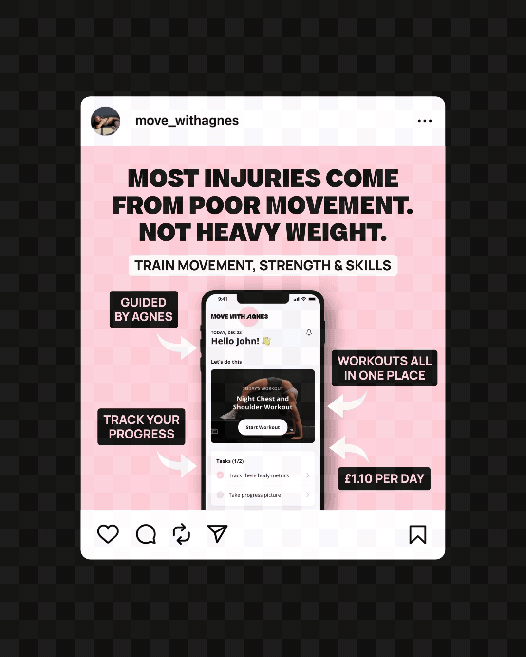
Move with Agnes was created to support the launch of Agnes’ new fitness app - a platform focused on mobility-led strength training and movement for longevity. Designed primarily for women, the app encourages a more balanced and sustainable approach to fitness, helping users build strength, confidence and resilience in a way that supports everyday life.
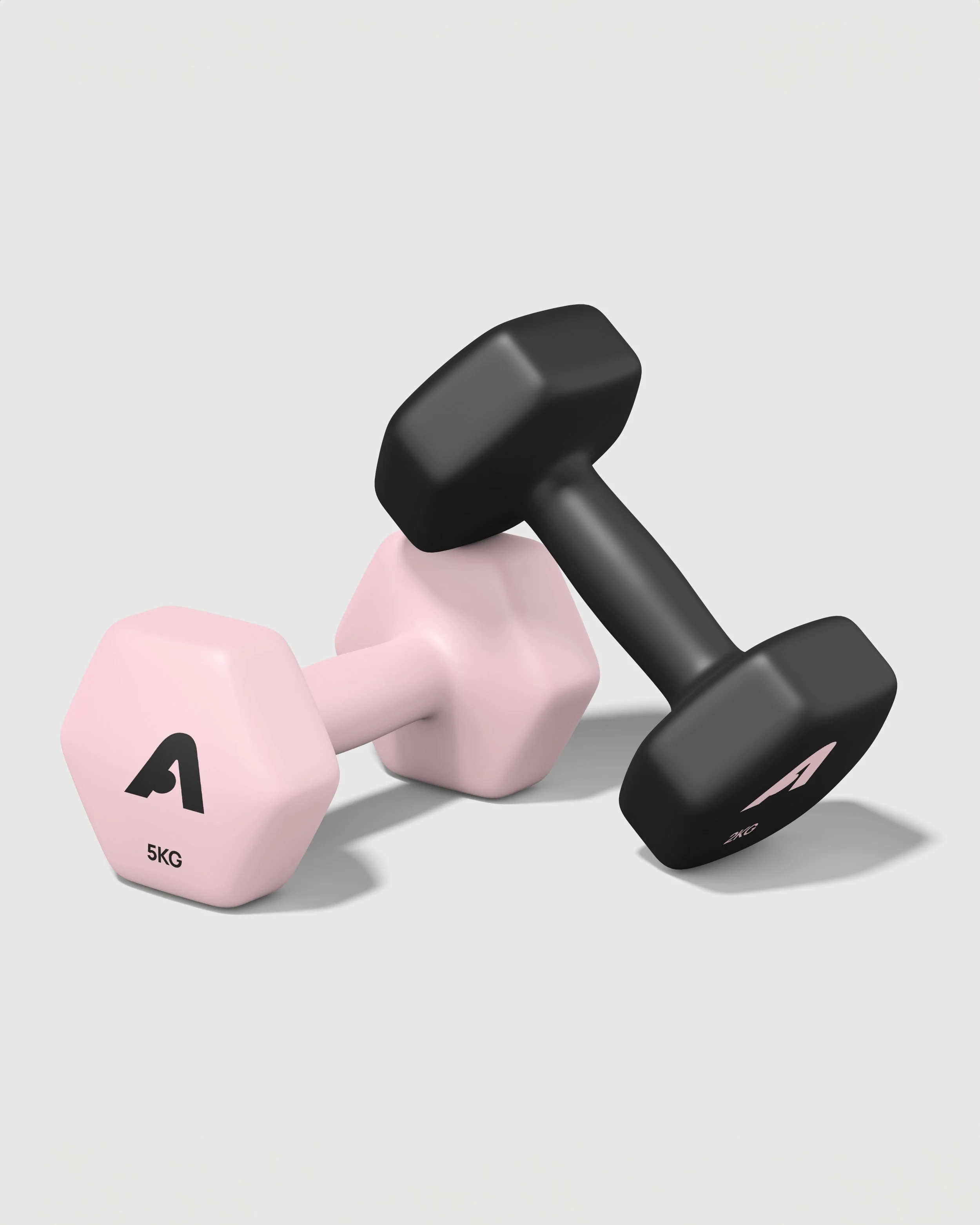
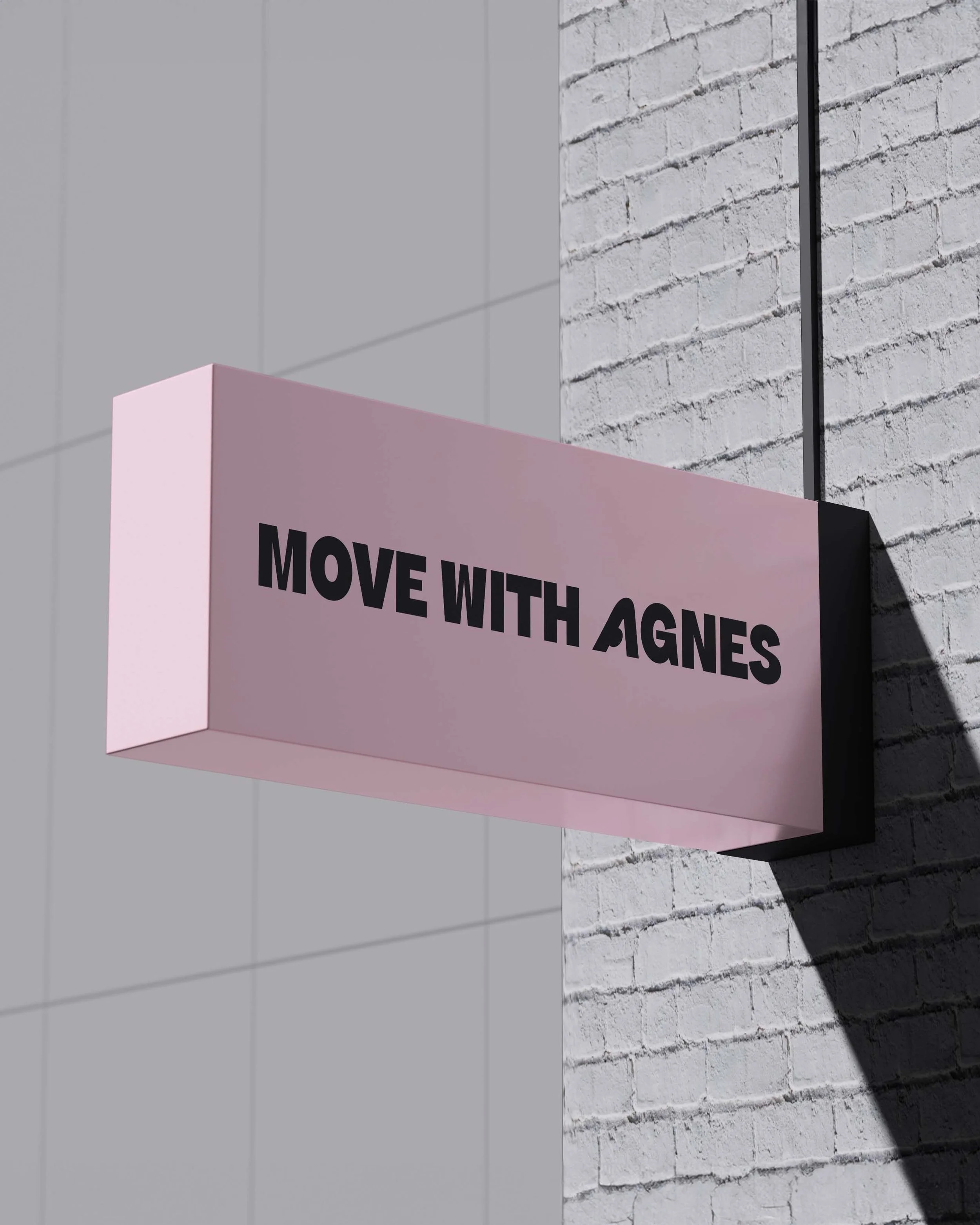
The visual identity was designed to reflect this philosophy. A custom brand mark inspired by body positioning and flexibility sits at the centre of the identity, helping create a recognisable visual language that could flex across the app, website and wider communications. This is paired with bold typography, curved graphic treatments and a soft but energetic colour palette designed to bring a sense of femininity and optimism to the brand. Photography direction focused on capturing movement in a way that felt strong and aspirational whilst still feeling natural and relatable.
To support the app launch, I also designed and built a fully custom Squarespace website that introduced Agnes’ philosophy, programme structure and coaching offer in a way that felt clear, engaging and easy to navigate. The digital experience was designed to feel like a natural extension of the brand - balancing storytelling, usability and conversion throughout.


“Becky has been incredible to work with. She asked all the right questions to ensure the design process aligned with my vision for the brand, and the results were better than I could've imagined.”
— Agnes Fry (@move_withagnes)